


Accessible Drupal Theming With Twig and BEM

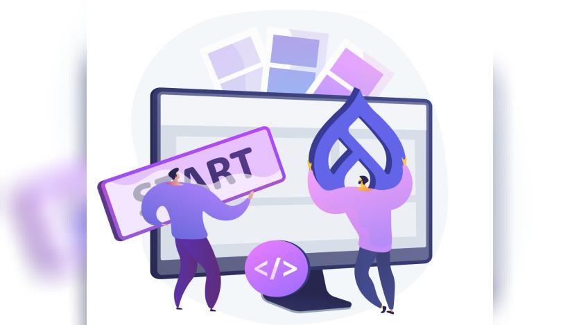
Accessible Drupal components depend on semantic markup, native interactive elements, visible keyboard focus, and visual styling. Satyam Prakash demonstrates that approach in a tutorial for Specbee, using an article card to show how Twig templates and Block, Element, Modifier (BEM) naming can address accessibility at the component layer. The example contrasts semantic elements and a real link with a generic clickable container driven by JavaScript.
The pattern establishes markup and CSS conventions before a component is reused across Drupal contexts such as Views and Layout Builder. Prakash uses BEM classes such as card__title and card__link instead of selectors tied closely to Drupal-generated class structures, while the Twig example preserves Drupal attributes and translation handling. A native <a> element and :focus-visible styling provide link semantics and a visible focus treatment for keyboard navigation.
Testing remains part of the workflow rather than a substitute for sound markup. The tutorial recommends keyboard-only navigation, screen-reader checks with NVDA or VoiceOver, colour-contrast review, and testing at 200% zoom before treating a component as complete. It also recommends working through Drupal's render system instead of reading raw field values directly and applies the same semantic approach to buttons and other interface components in the full tutorial.
ASK: Drupal Community Needs Your Support
View all →
Disclosure: This content is produced with the assistance of AI.
Disclaimer: The opinions expressed in this story do not necessarily represent that of TheDropTimes. We regularly share third-party blog posts that feature Drupal in good faith. TDT recommends Reader's discretion while consuming such content, as the veracity/authenticity of the story depends on the blogger and their motives.
Note: The vision of this web portal is to help promote news and stories around the Drupal community and promote and celebrate the people and organizations in the community. We strive to create and distribute our content based on these content policy. If you see any omission/variation on this please reach out to us at #thedroptimes channel on Drupal Slack and we will try to address the issue as best we can.
Related Organizations

You may also like