
Optimizing Website Images: Drupal's Responsive Image Styles Explained

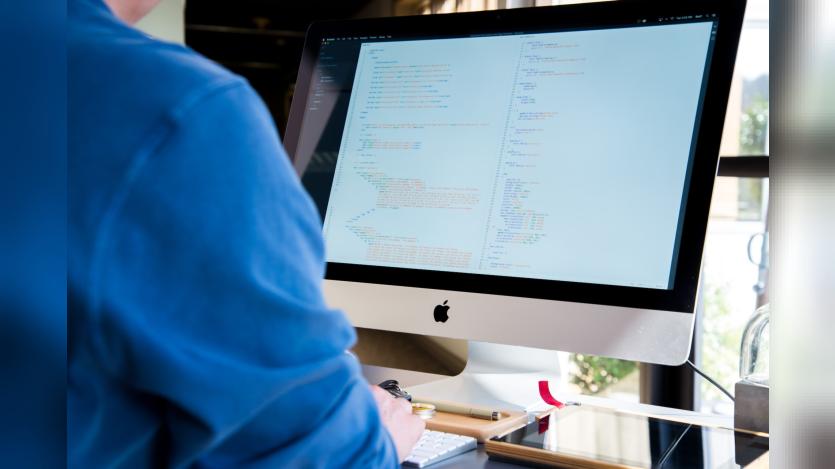
Drupal offers robust tools, such as Image Styles and Responsive Image Styles, ensuring seamless integration of images across websites. Amanda Luker, a Senior Frontend Engineer at Four Kitchens, discusses a practical approach to convert images into Drupal. Highlighting the need for multiple image versions, Amanda emphasizes Responsive Image Styles in Drupal, providing diverse images based on screen size.
She suggests AI tools to generate variations and introduces the Easy Responsive Images module for streamlined creation. Additionally, she details steps to create responsive image styles and map Media View Modes, ensuring optimal image display across various breakpoints. Amanda concludes by noting the use of custom theme Breakpoint Groups for distinct aspect ratios at different breakpoints, emphasizing Drupal's flexibility in image handling.

ASK: Drupal Community Needs Your Support
View all →
Disclosure: This content is produced with the assistance of AI.
Disclaimer: The opinions expressed in this story do not necessarily represent that of TheDropTimes. We regularly share third-party blog posts that feature Drupal in good faith. TDT recommends Reader's discretion while consuming such content, as the veracity/authenticity of the story depends on the blogger and their motives.
Note: The vision of this web portal is to help promote news and stories around the Drupal community and promote and celebrate the people and organizations in the community. We strive to create and distribute our content based on these content policy. If you see any omission/variation on this please reach out to us at #thedroptimes channel on Drupal Slack and we will try to address the issue as best we can.

Related Organizations
Related People


You may also like